Improving site navigation and usability by refining Goodreads' book tracking/review features.
What is Goodreads? Goodreads is a platform made for readers to discover new stories, receive recommendations, keep track of their books, stay updated with the latest publications/authors, interact with the online community, and so much more.
My role. To assess how Goodreads users track their books and to provide design recommendations. Specific responsibilities and deliverables include: (1) conduct heuristic and competitive analysis, (2) develop a participant screening test, unmoderated testing guide, and moderated testing script, (3) interview readers and act as a moderator, and (4) create a presentation to share findings and proposed design recommendations. **Wireframes/prototypes were an added touch to convey my design recommendations and challenge myself. :)
Timeline
5 weeks, Spring 2023
Discipline
UX Design
UX Research
Team
Individual
Tools
Figma
UserTesting
Tl;dr
Optimizing layout for focused content viewing.
Why? The current layout makes it difficult to locate specific content. Grouping sections creates clear separations between elements, making them easier to identify. This approach aligns with the conventions of other sites that use a three-column layout (ie. Linkedin and Facebook).
Following established UI conventions and standardizing design elements for consistency.
Why? The inconsistent use of design elements creates a disjointed user experience and contribute to the overall perception of an unpolished interface. Additionally, unclear labeling of features often left users unsure of their purpose. Many participants reported needing to click on options just to understand their function or avoided them altogether out of confusion. These issues are compounded by deviations from established UI conventions. By fixing these usability issues, Goodreads can create a more cohesive and seamless experience, allowing users to focus on completing their tasks rather than deciphering the interface.
Addressing the visibility of essential features.
Why? Currently, deleting a review requires users to manually erase each of their responses in the form fields for the review to be considered deleted. This process is cumbersome and unintuitive, so simplifying it by adding a straightforward 'Delete Review' option would improve usability.
Process (Methodology)
The methods for our approach.
Our research methods included heuristic and competitive analysis, followed by unmoderated and moderated usability testing (6 participants).
Moderated and Unmoderated Usability Testing
Heuristic Analysis
Understanding where things go wrong in relation to the objective.
I analyzed the Goodreads site, documenting the procedures that users would take to fulfill the objective. These were the three primary features that related to the objectives. parts of the interface might keep users from fulfilling the objectives, and I conducted a heuristic analysis using Jakob Nielsens's 10 general interaction design principles of the three tasks in order to find usability issues within these functions.
Task 01
Task 02
Task 03
Adding books to bookshelves.
Documenting reading progress.
Creating and deleting a review.
Task 01
Adding books to bookshelves.
Bookshelves are a place where users can organize and personalize their books. However, the interface design choices, specifically with text and placement creates a clutter to the UI leading to a paradox of choice. The positioning of filter and sort option on the bottom of the page are not synonymous to app standards, requiring users to search or figure out the meaning of certain options.
Task 02
Documenting reading progress.
Users can track the progress of their books on the home page, but only on the home page. The visual design choices make the feature blend in to the surrounding interface and makes it difficult to differentiate between other text or information on the webpage. The modal also lacks hierarchy and sequencing with the addition of too many typographic choices making it difficult to digest what is being asked and what buttons a user should click.
Task 03
Creating and deleting a review.
With a mix of too many typographic inconsistencies and a lack of hierarchy, the ratings page is a difficult to digest. Similar to the other tasks, the buttons and features do not look distinctive and the lack of space makes the page look like a wall of text. Positioning of buttons is also notable as it does not match placement seen on other pages.
Competitor Analysis
How do competitors fulfill the tasks?
I looked at two alternative book discovery and organization services, analyzing what they did well and what they did wrong while trying to fulfill the same tasks as I did on Goodreads.
Usability Testing
Identifying our users for testing.
Before testing, I created a participant screener, as well as scripts for my unmoderated and moderated tests.


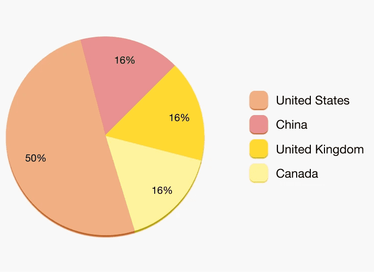
Participant Profiles (n=6)
Usability test summaries.
I conducted three unmoderated and three moderated usability tests. These were the key findings that were mentioned in all six of my usability tests. Essentially, while there were some issues with the user flow to fulfill task requirements which could be attributed to the UI, as all users had something to say about visually inconsistencies across the UI, which created a very frustrating user experience.
Task 01 ✅
Task 02 ⚠️
Task 03 🚫
Adding books to bookshelves.
Participants were able to complete the task successfully.
Documenting reading progress.
Participants were able to complete the task; however, some experienced confusion or difficulty doing so.
Creating & deleting a review.
Participants were unable to complete the task and/or mistakenly believed they had completed it.
Primary Insight 01
Participants frequently commented (negatively) on the UI of "my books" tab (ie. clutter, text, font size, etc.).
Primary Insight 02
Participants had trouble locating where to document their reading progress as the feature is not apparent in the UI.
Primary Insight 03
Participants were not able to delete their rating and review because there was no option to do so.
What our participants had to say.
While reviewing my usability tests, I collected quotes from each of my six participants that encompassed their experience and what they commented on most frequently.
Key Insights
What exactly did our participants have the most issues with?
While reviewing my usability tests, I noted down the primary tasks or features that my collective group of participants struggled with or commented on frequently as a result of underlying UI design flaws.
Content density and cluttered layout.
There are many text-heavy sections without breaks or clear hierarchy.
Inconsistent use of design elements.
Font sizes, styles, and capitalization are applied unevenly across the site.
Absence of expected features.
Users are unable to find or access expected features, such as the ability to delete a review.
Design Recommendations (Prototype Ver.)
Optimizing layout for focused content viewing.
Improving consistency through design standardization.
Addressing the visibility of essential features.
Ending Notes
Some closing thoughts and reflection.
With this being my first experience using tools like UserTesting, my design research course also introduced to me a variety of other research methods and other aspects that I should keep in mind, which has helped me widen my breadth as a designer.
Metrics.
Since my primary focus was on qualitative research, I would test metrics such as time to locate specific content, task completion rate, error and accuracy rates, and feature usage to evaluate whether my recommendations lead to impactful improvements. Additionally, I would use A/B testing to compare my designs against the current interface.
Testing is hard.
Despite being the interviewee in this situation, I initially thought I would have an easier time… only to find out that moderating interviews was just as hard. From planning scripts to reading your participants, to staying mindful of potential biases as a moderator, it was a lot to manage. But it was a valuable experience that I'd like to build upon as I gain more practice.
Exploring "bookshelves" further.
If I were to continue researching, I want to focus more on the 'My Books' tab and how users would navigate through the page. The current UI and functionalities are quite interesting and sparked a lot of responses in my usability tests, so if I had the chance to do things differently, I would have created more difficult task prompts, as well as going into more detail on the bookshelves and its functionalities for future tests.
More of what I would have done differently.
I wish I had asked more thoughtful and focused questions during my usability tests. I also could have been more thorough with my participant screeners to ensure I was working with people who truly represented the target audience. Moreover, I would have narrowed down my focus and clarified my prompts earlier in the process, as I found myself unsure whether to prioritize Goodreads users or people who had never used the platform.


