© 2024
résumé ↗
Bubblofi
Empowering students to overcome procrastination with self-compassion and a new perspective.
College students face a paradox: an abundance of productivity tools, yet a persistent struggle with procrastination. This disconnect raises questions about the effectiveness of existing solutions, presenting an opportunity to explore why traditional approaches seem to fall short and develop an alternative solution that would better address students' needs.
My role was to design an end-to-end experience for a productivity application that would help college students better manage their time given all of their responsibilities. However, this objective changed quite drastically early on in the process when I realized that simply iterating on time management strategies wouldn't solve the issue at its core...
Timeline: 5 weeks, Fall 2023
Disciplines: UX, IxD
Team: Individual
Tools: Figma, Notion
Problem
Complex, negative emotions fuel procrastination, keeping students trapped in a cycle of avoidance.
Through generative research including in-depth secondary research, five user interviews, and five competitive product analyses, I found that traditional management frameworks fail to address this core issue.
So, the solution? Well...

Solution
Imagine combining the satisfaction of crossing off items on your checklist with the addictive feeling of popping bubble wrap…
Preview
Meet Bubblofi.
Bubblofi is an interactive productivity tool that turns the stressful, anxiety-inducing process of managing responsibilities into a motivating and playful experience.
↲
We make starting easy with just a press and hold, giving users control over their workflow from the get-go.
01. Personalize to-dos with three simple customization options.
Users have very simple, streamlined customization options available after they create a bubble, located at the top area of the keyboard, including editing size, color customization, and tags.
02. Inadvertently learn to prioritize through bubble sizes.
With a long-press gesture, users can adjust the size of their bubbles based on how long they hold the screen. This inadvertently helps them prioritize, as larger bubbles can signify more important responsibilities.
03. Break down larger tasks into more manageable steps.
Bubbles can also be broken down to contain subtasks, making responsibilities more manageable and providing a clearer visualization of the path users need to complete them.
04. Celebrate all the wins.
Popping a bubble in Bubblofi mimics the satisfaction of crossing off tasks on a checklist or popping bubble wrap. It reinforces that every step forward is worth celebrating, motivating users to keep going and turning progress into a fun experience.
05. Track your progress visually.
Users can view their "popped," or completed tasks in the archives panel, giving them a clear visual of their progress. This feature gives students a sense of accomplishment and motivates continued action.
Bubblofi turns procrastination into a stepping stone for progress, making task management approachable and emotionally aligned with students' needs.
But how did we even get here? Why bubbles ? 🫧

Design Challenge
"Managing academics and personal obligations is a source of stress for college students. How can we help?"
This design challenge initially felt too broad, meant to inspire creative direction while addressing the range within this problem, but it left me struggling with its scope. So, I began by narrowing the focus through secondary research.
Secondary Research
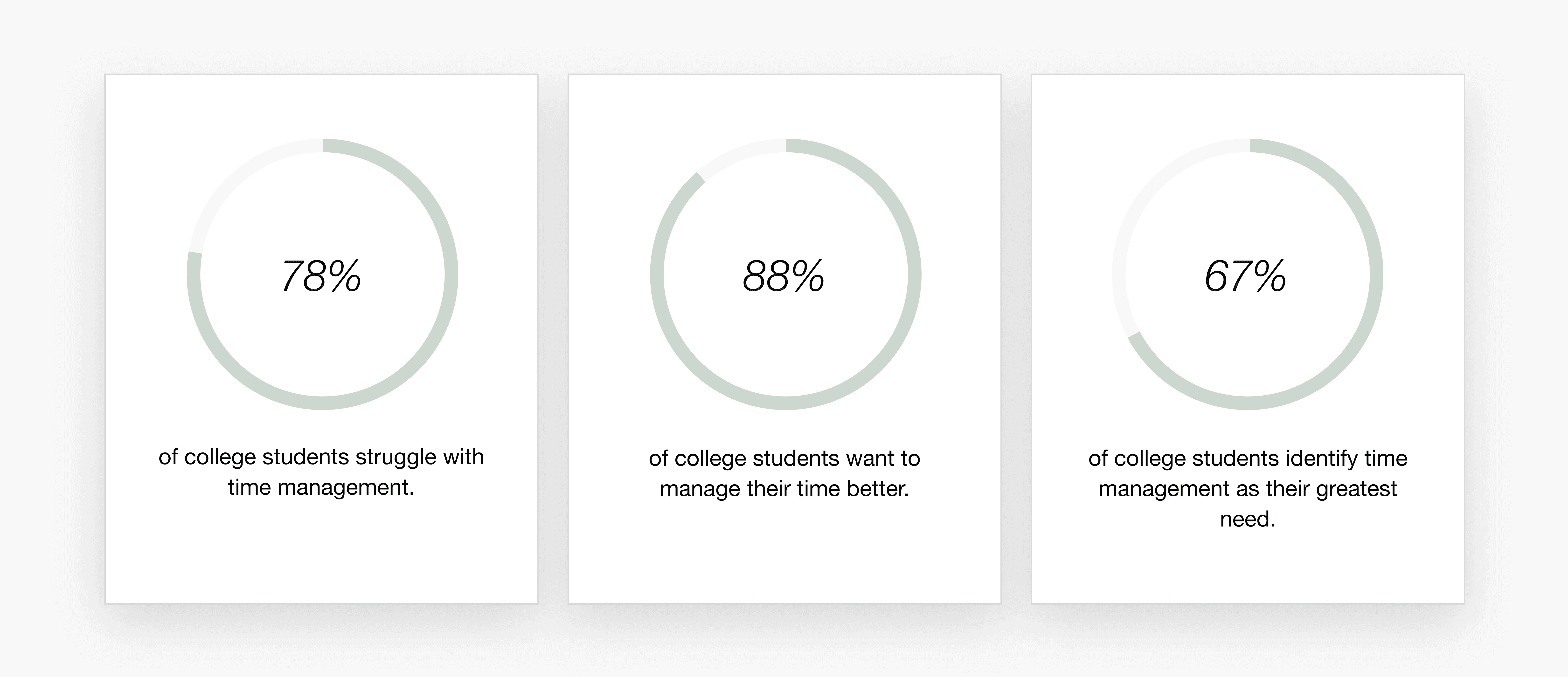
I found that time mismanagement was prevalent and persistent, indicating that current systems were ineffective.
My secondary research consisted of a brief understanding of the current state of college students and their productivity/time management habits to determine the problem area's relevance. Given the persistence of time mismanagement, it was clear that a different tool was needed.
Primary Research
Focus points for discussion and investigation.
🗓️ Methods. How do students currently manage their time/responsibilities?
💥 Challenges. What barriers do students face in staying productive?
🧠 Behaviors. What factors influence how students approach time management?
Interviews — 5 participants
To better understand the space, I conducted semi-structured interviews with five college students across different majors and universities. I found that that their responses to time management were rooted in emotions and overwhelmingly negative.
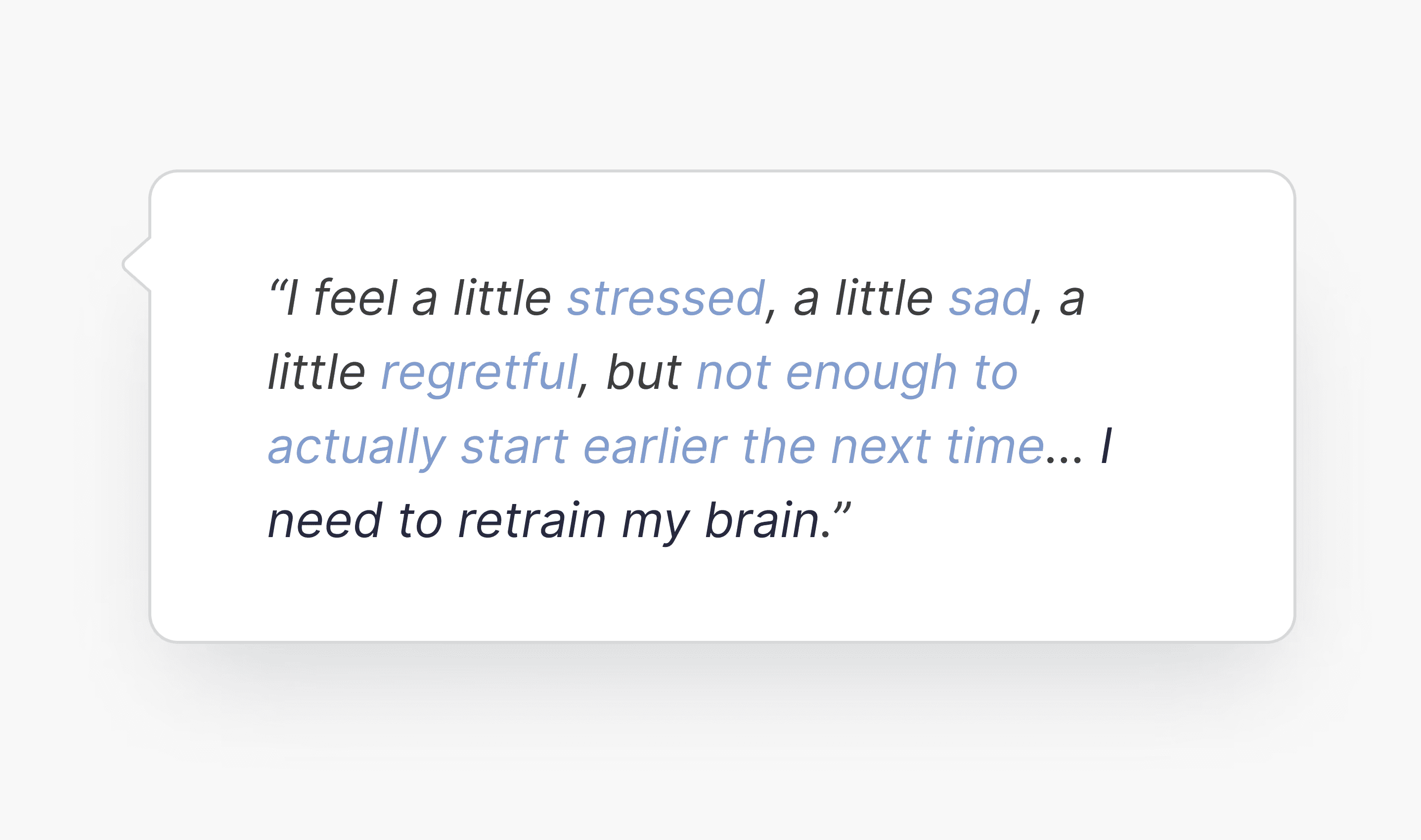
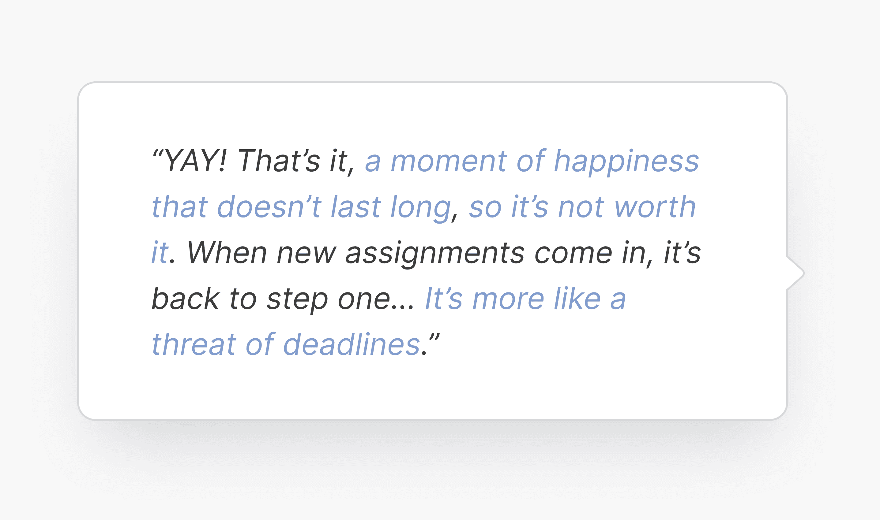
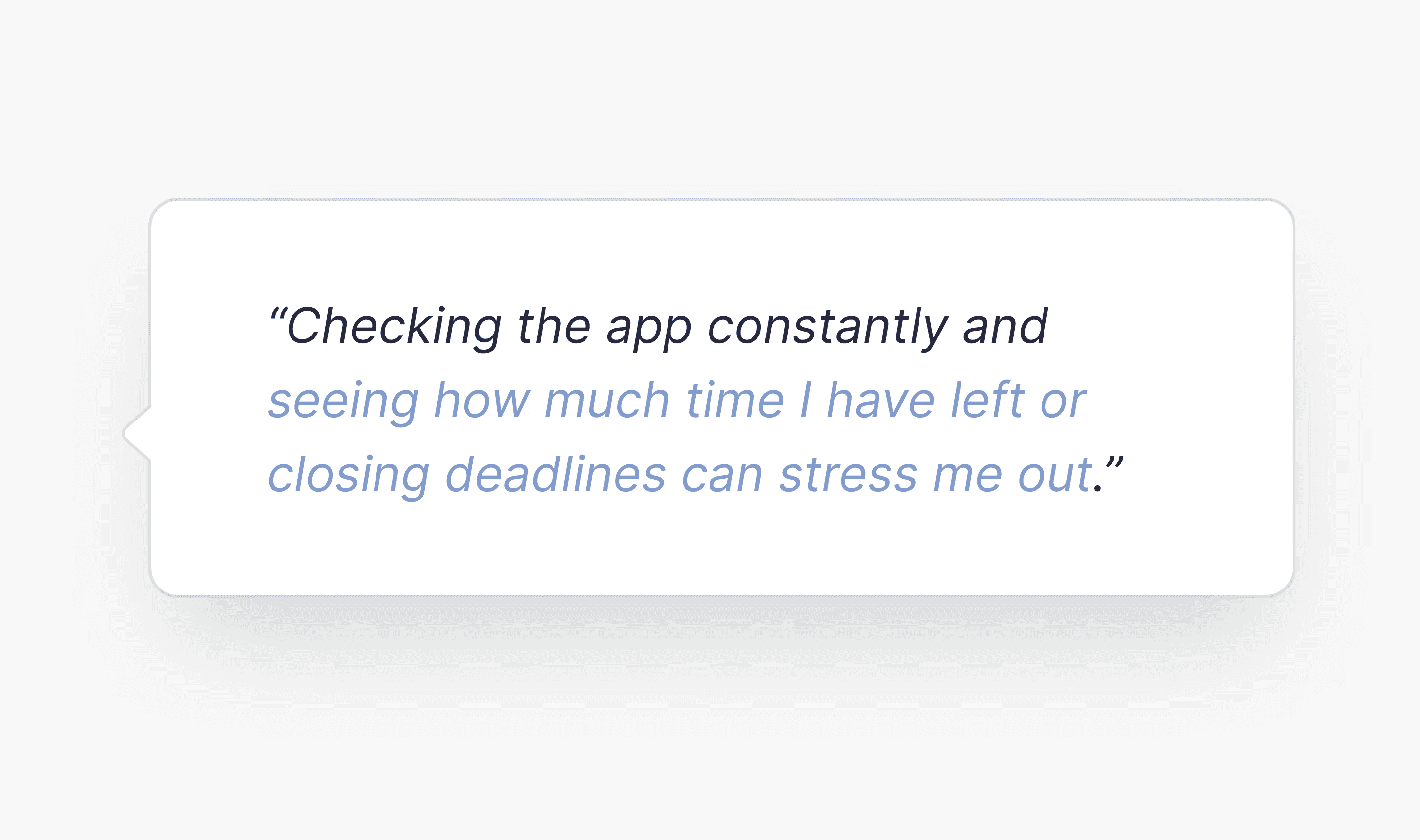
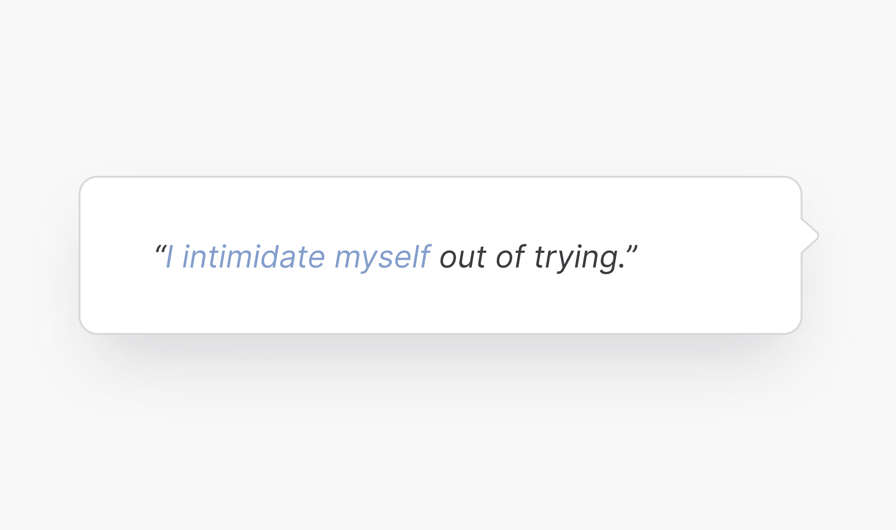
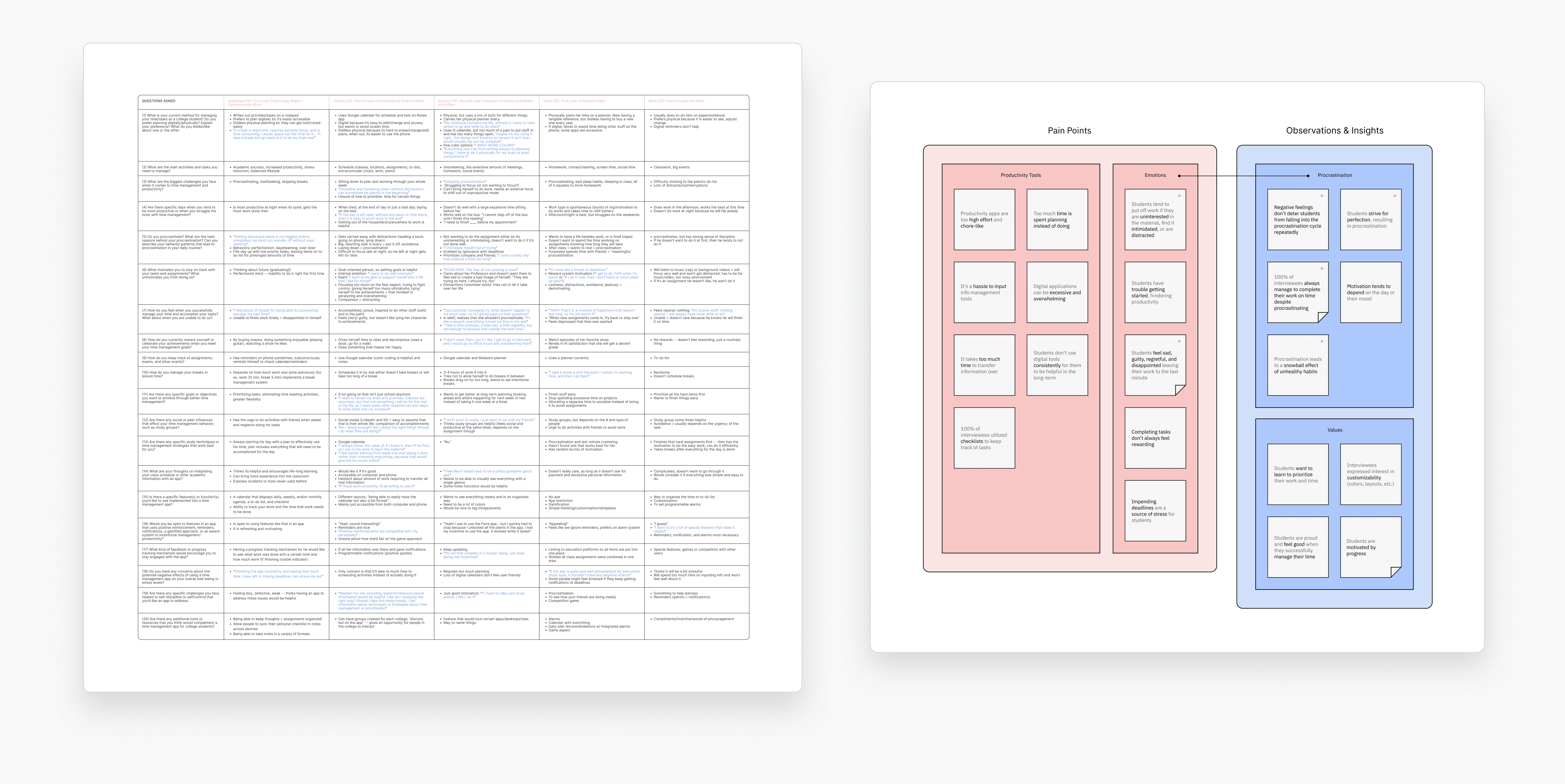
Utilizing an affinity diagram, I consolidated the observations and insights gathered from my interviewees to identify the most critical and common issues. Through this, I uncovered an interesting connection between emotions and procrastination.
Competitive Analysis
Structure-based tools only serve as temporary solutions.
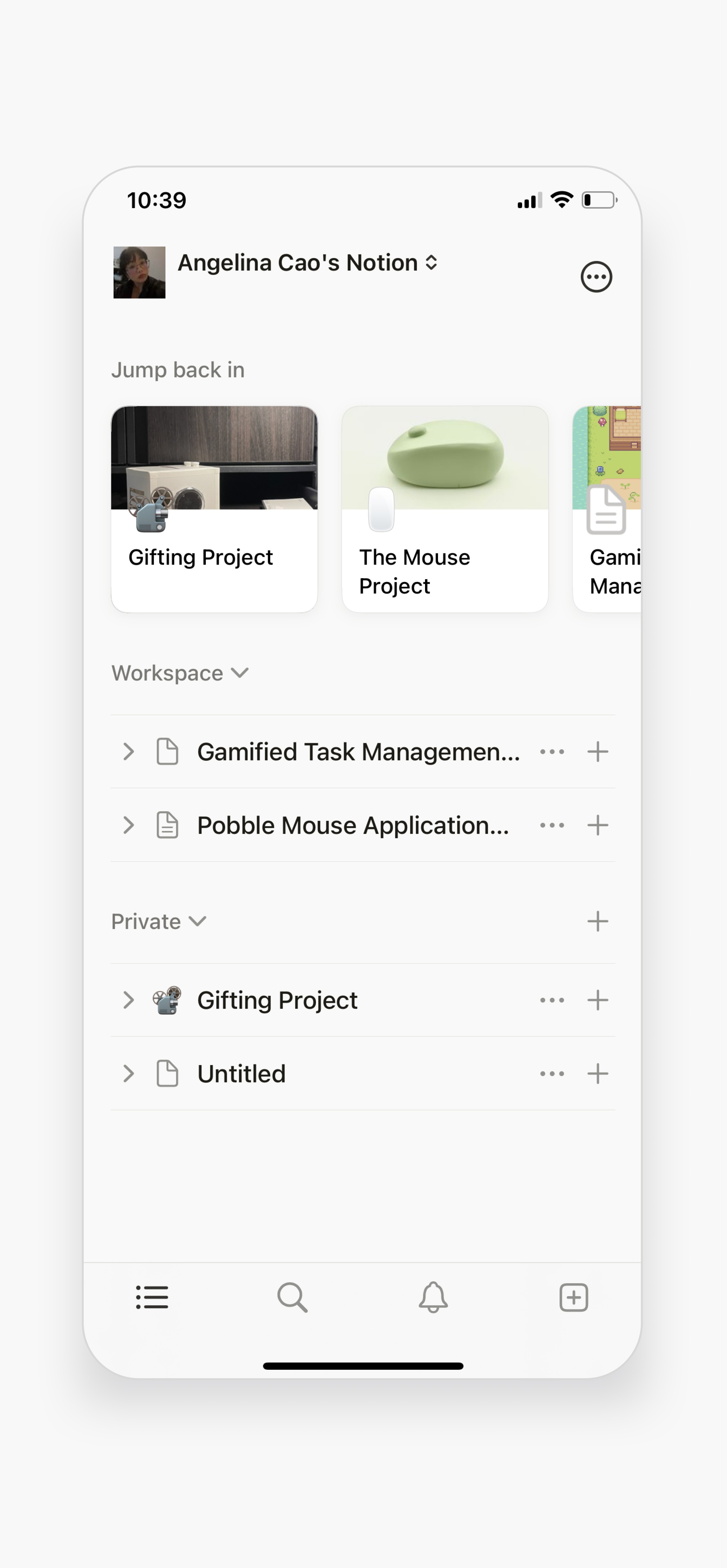
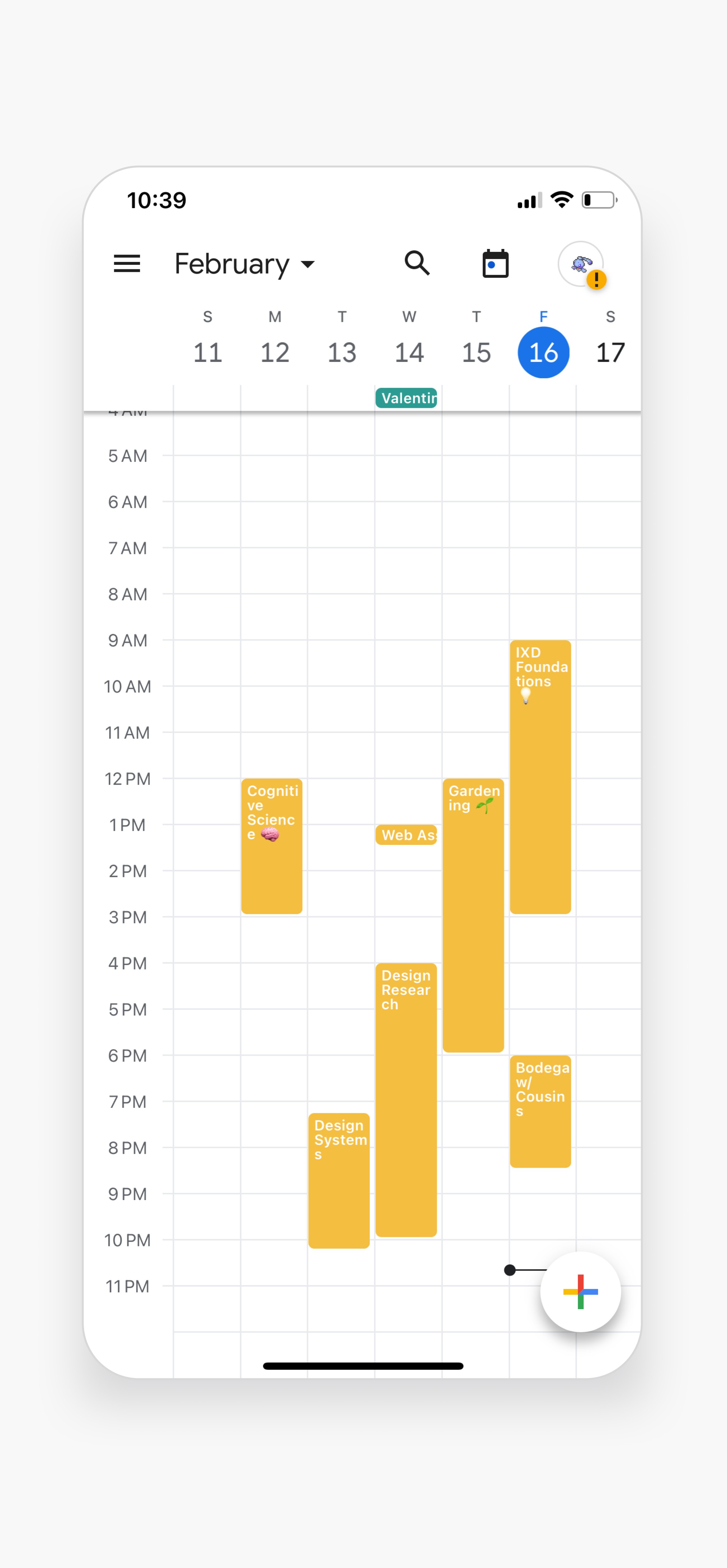
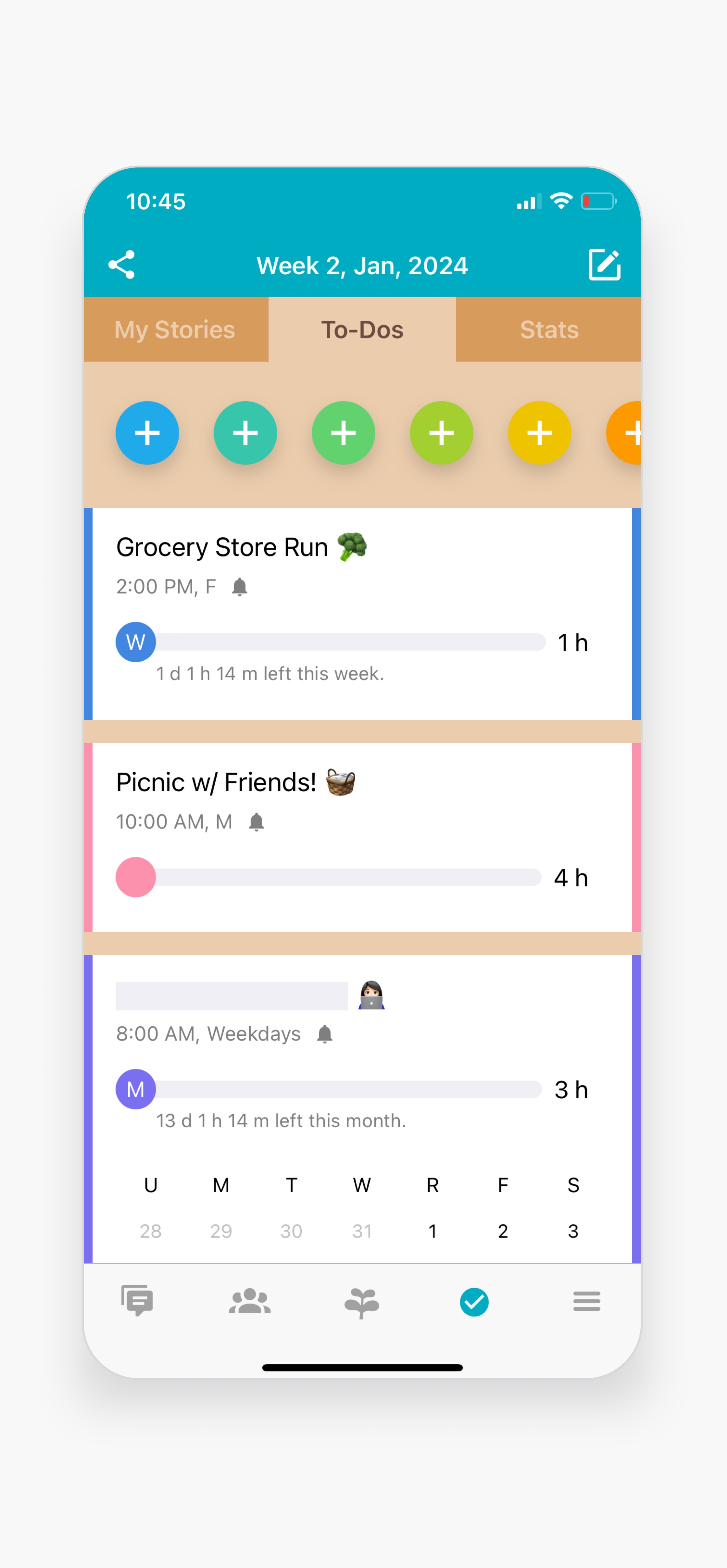
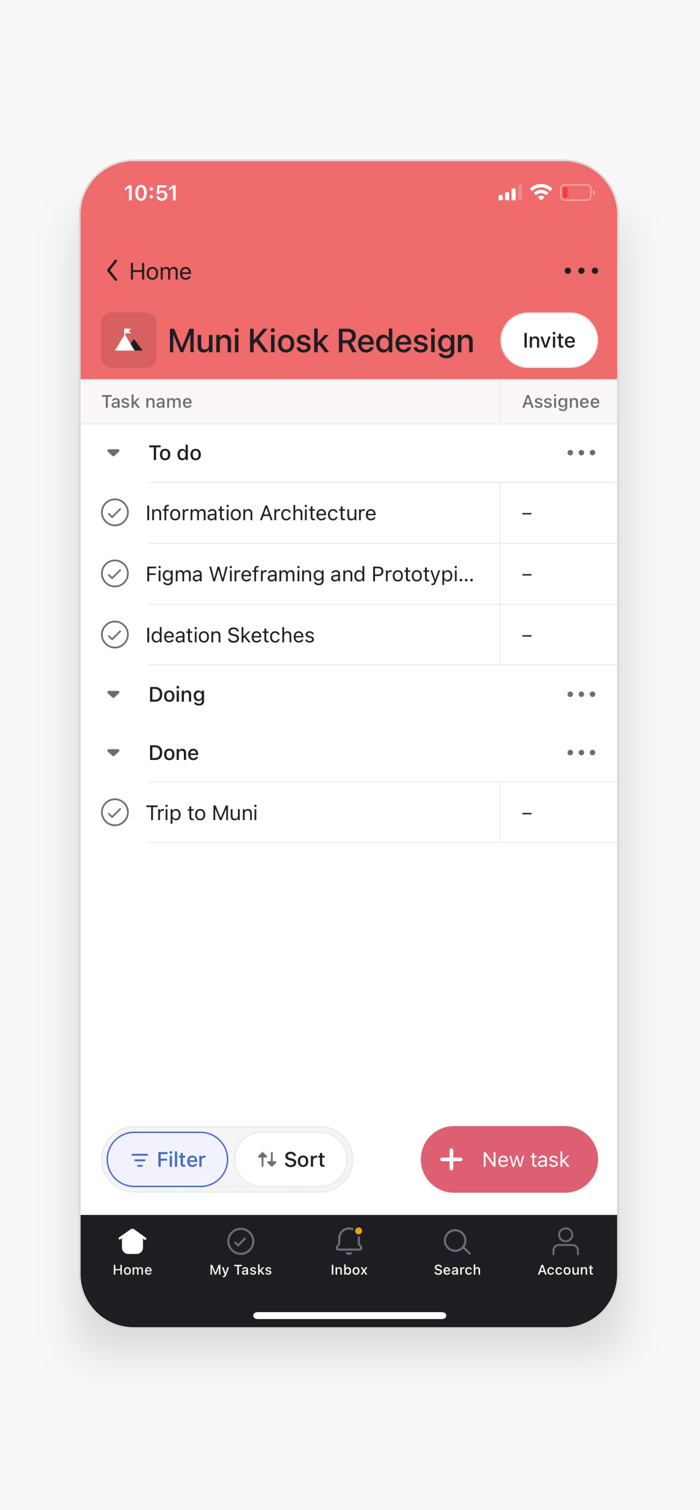
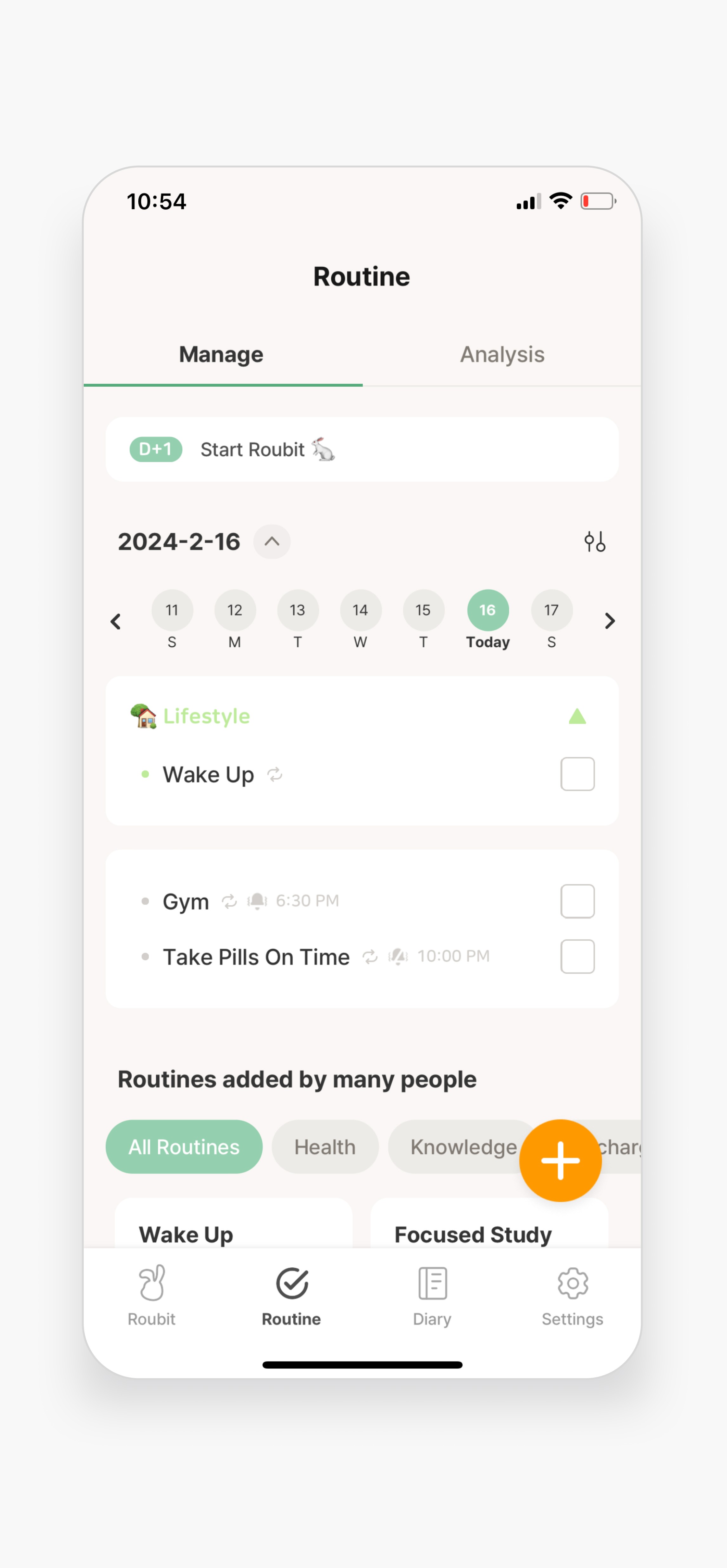
Diving deeper, I analyzed popular time management apps, including those mentioned in my interviews. These tools focused primarily on structure-based techniques that were either complex or required too much effort to maintain, making it difficult for procrastinators to get started, thus leading to eventual disengagement.
Synthesis
It's an emotion-management problem, not a time-management one.
The main insight was that procrastination/time mismanagement primarily stems from emotional irregulation.
💡
Students still meet their deadlines despite procrastinating.
Students, even at the expense of their well-being and work quality, lack the incentive to change their procrastination habits since they still do their work on time.
💡
Rumination perpetuates the cycle of procrastination.
Repetitive negative thoughts including (but not limited to) perfectionism, anxiety, guilt, and fear of failure hinder students’ ability to get work done in a timely manner.
💡
Using digital productivity tools feels like a chore.
Many time management apps are high-effort and excessive, which makes the initial steps toward time management feel burdensome and overwhelming.

Design Requirements
The main design challenges and requirements based on the insights.
Pain Point 01
Using digital productivity tools feels like a chore.
Pain Point 02
Rumination perpetuates the cycle of procrastination.
Pain Point 03
Students still meet their deadlines despite procrastinating.
Design Question 01
How might we encourage students to start acting on their responsibilities timely?
Design Question 02
How might we disassociate negativity that comes from students' academics?
Design Question 03
How might we help students form healthy habits alongside meeting deadlines?
Design Requirement 01
Approachability. 🌀
Lower the barriers that often prevents students from acting on their tasks.
Design Requirement 02
Positive Associates. 🫀
Shift the emotional response to procrastination from negative to self-accepting.
Design Requirement 03
Gradual Change. 🌱
Focus on incremental progress rather than sudden transformation.
Ideation
After a multitude of ideas that fell short…
I realized my concepts felt too complex or similar to existing apps, so I revisited my research. Seeing that all my interviewees used checklists inspired me to design something just as simple and familiar (but better!).
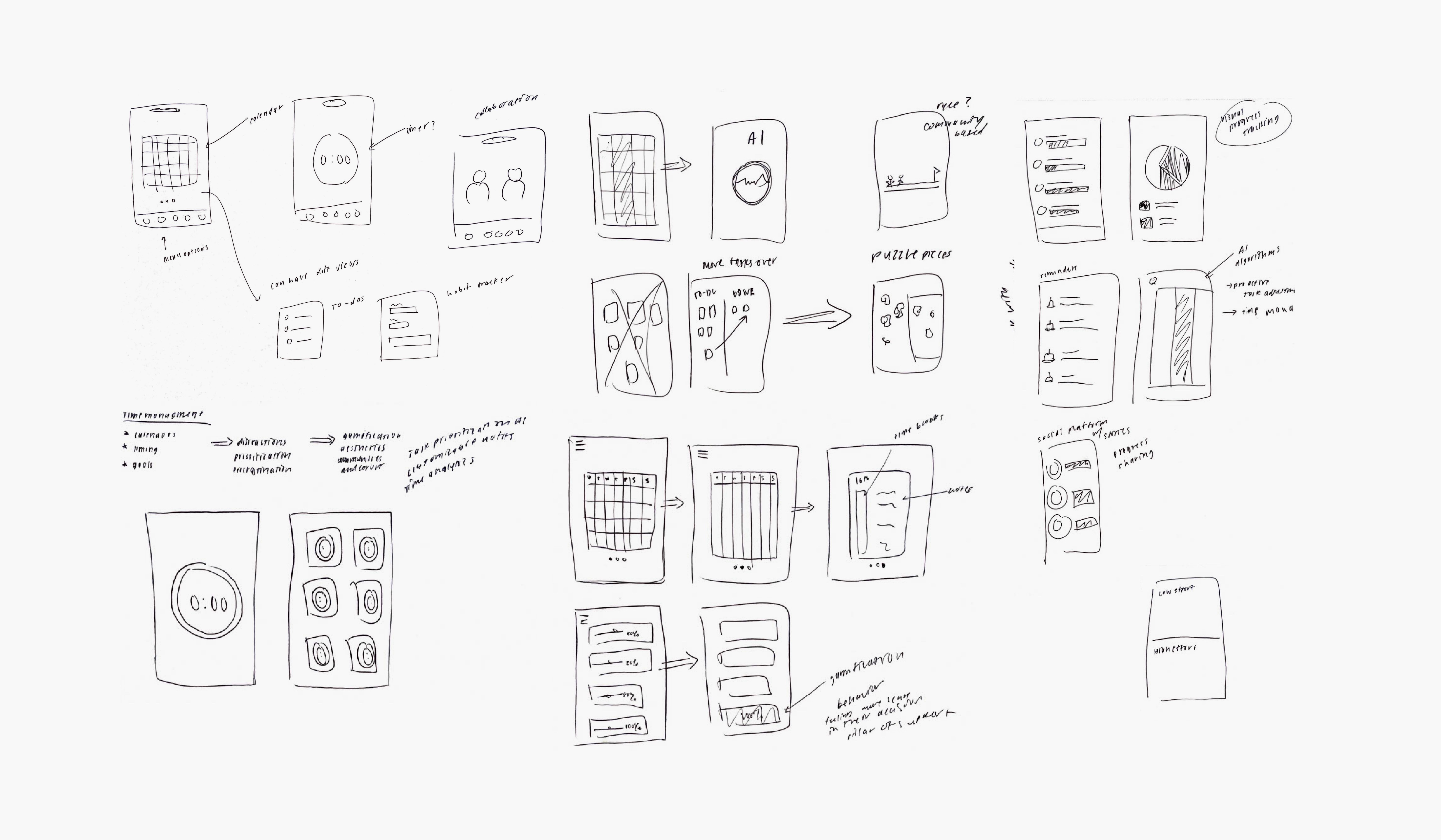
Ideation
The aha moment!
As I sketched, the idea of "bubbles" came to mind where timers shaped as bubbles popped with confetti when deadlines hit. The positive feedback from my cohort encouraged me to keep developing it.
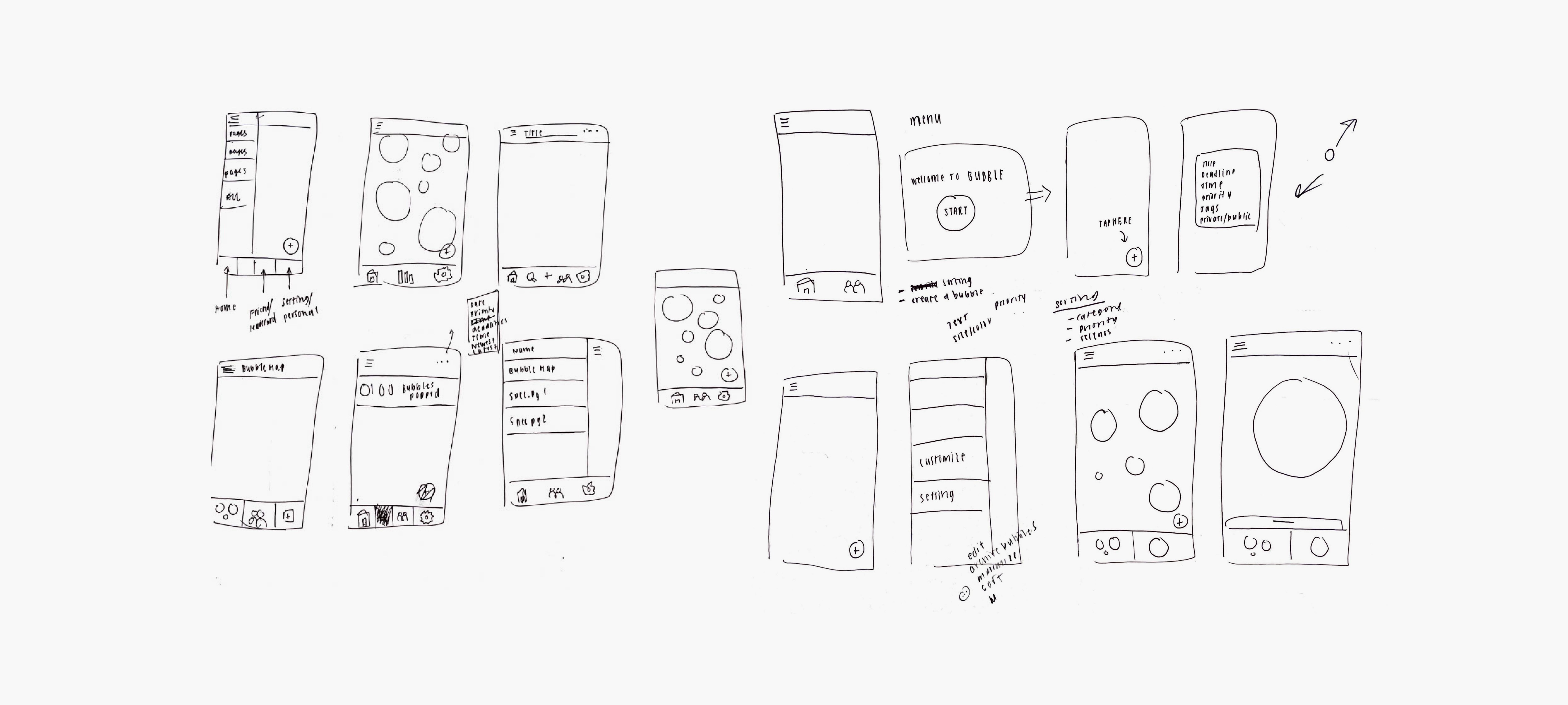
Design Explorations
Interface and interaction explorations.
The CTA and information input are critical triggers that would initiate or halt user action. From user feedback, I realized that my initial designs reinforced avoidance behaviors. As I iterated on my ideas, I focused on making interactions as easy, quick, and enjoyable as possible.
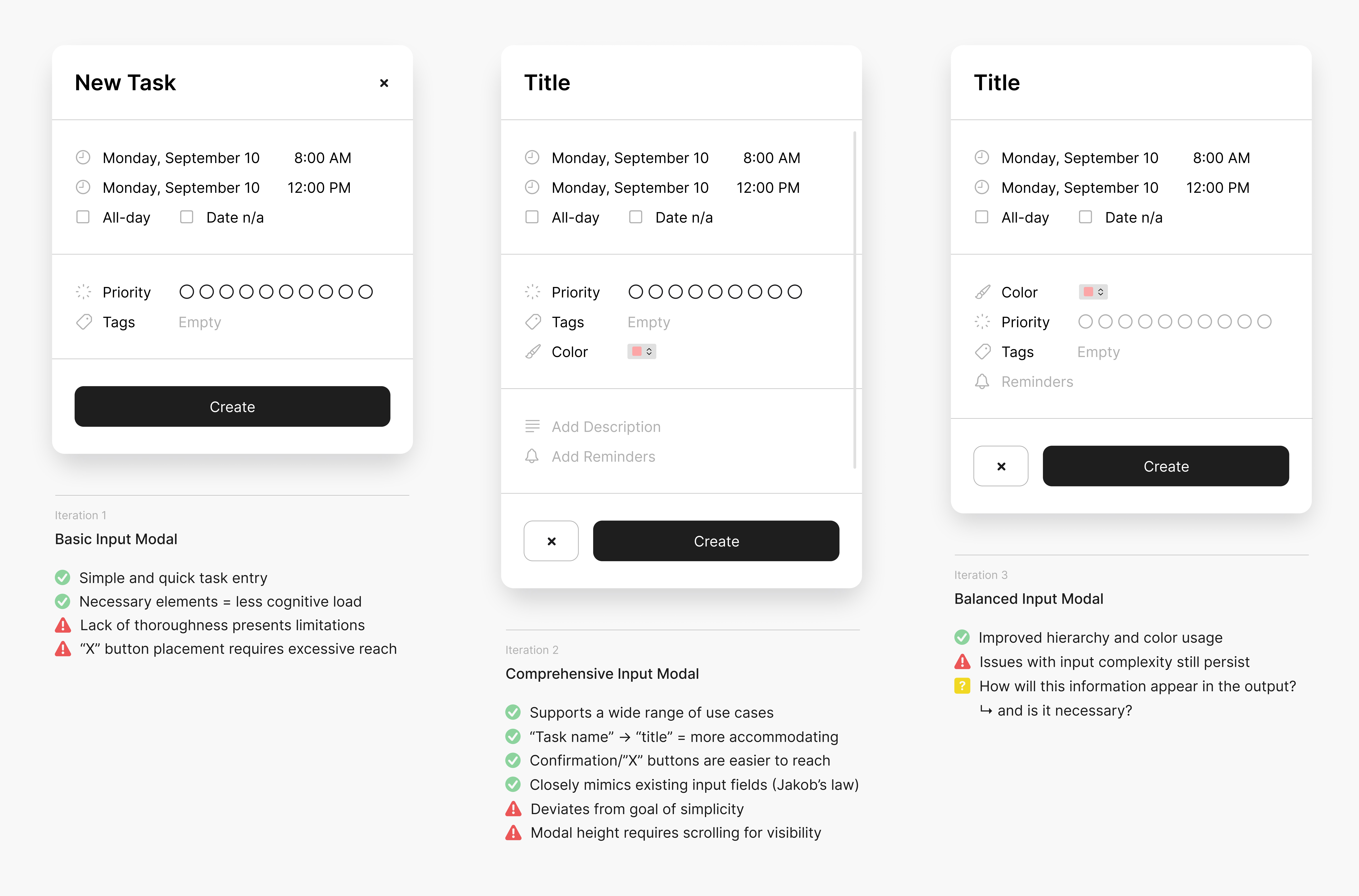
Standard modal
I initially designed a standard modal, a common feature in productivity platforms, for adding new information. However, this approach created issues with clarity and over-complexity, which made me rethink how to display the inputted information within the limited space of the bubble and question if it was necessary.
Slide-up modal
I also explored a slide-up modal that allowed users to see the bubble on the screen while inputting information. However, this caused redundancy, particularly as I brainstormed how the bubble would be displayed. Additionally, the modal clashed with the keyboard when it came time to enter text.
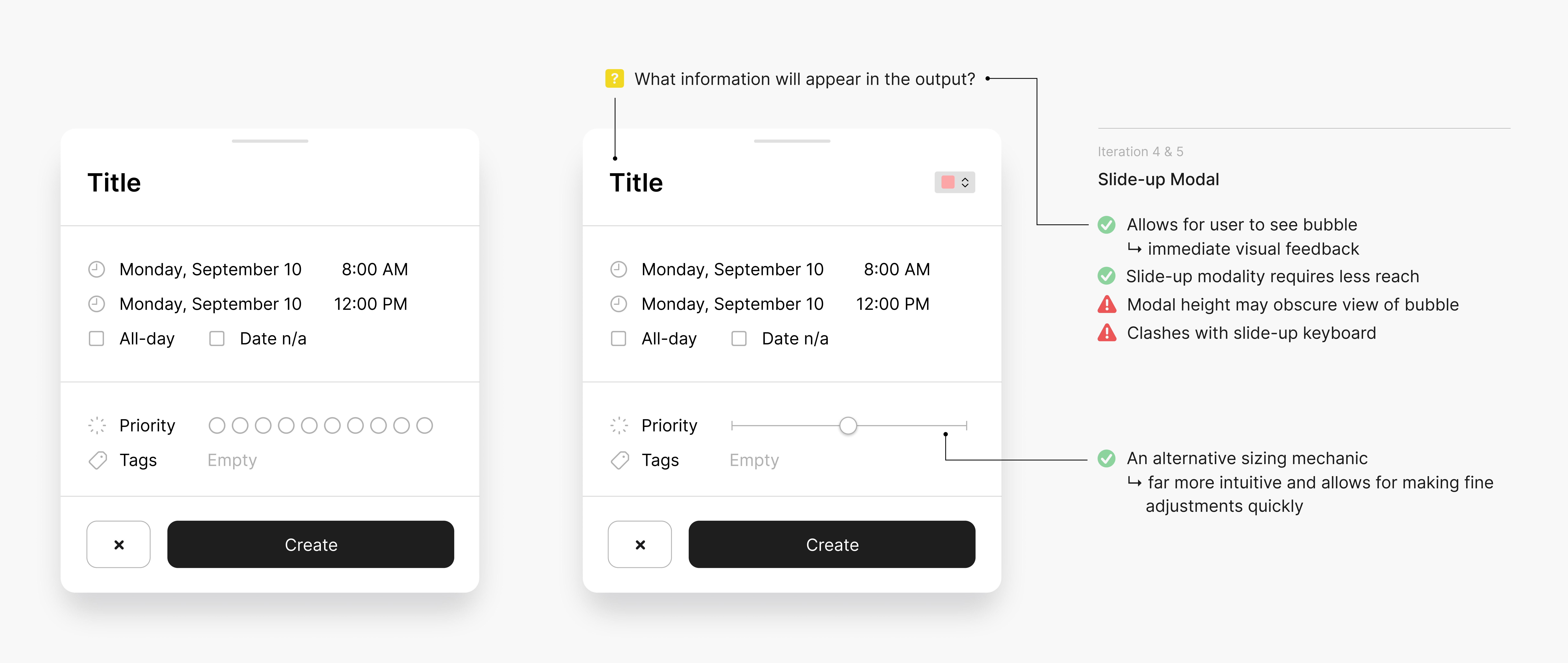
But… users still found these input modals wayyyyyyy too demanding and unnecessary. This required me to change my approach entirely. ⚠️

"Blow a bubble" by long-press gesture
I tried a new interaction using a long press gesture, eliminating the need for a cta "+" button and enabling users to create bubbles anywhere on the screen. This approach additionally allows users more flexibility to adjust bubble sizes beyond just prioritization.
Streamlined customization controls
The modal inputs have been simplified to three options: manual size adjustment, extensive color picker, and quick tag application. Positioned just above the slide-up keyboard, these features are easily accessible, allowing for quick interactions while leaving room for bubble visualization.
Bubble interaction explorations.
The bubble’s playful design is intended to make tasks feel less intimidating and more approachable. To fully develop this experience, it was crucial to focus not only on how users create bubbles but also on how they remove them.
Standard tap-to-pop
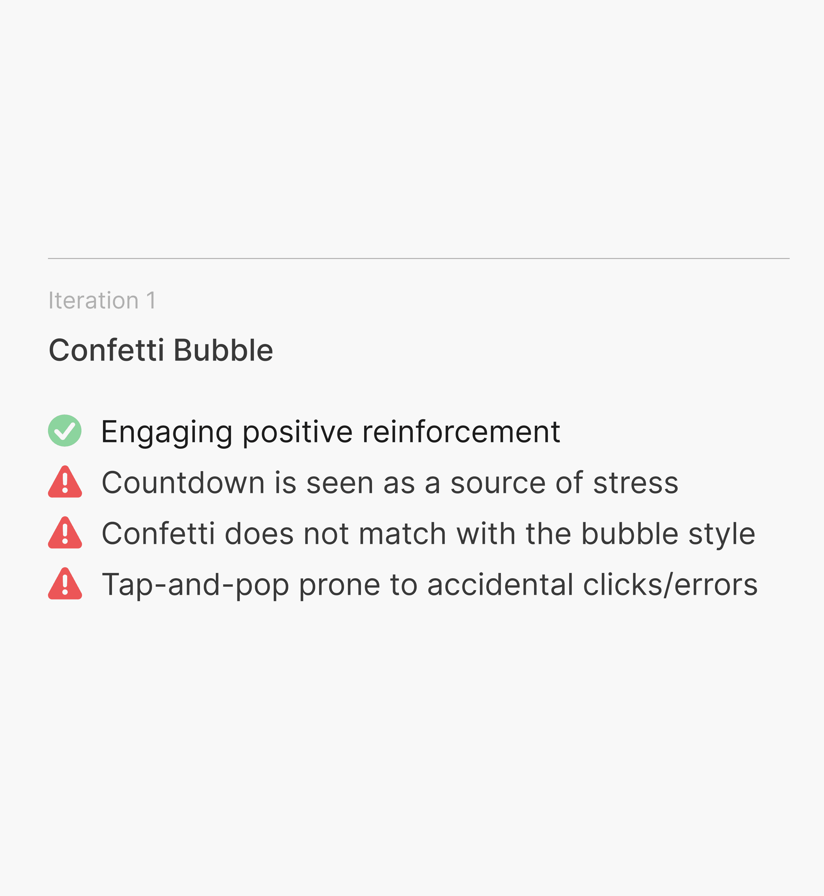
Building on my initial sketches, I designed the bubble with a countdown to specify the task/event deadline, but I found this added unnecessary stress for the user. I also realized that the click-to-remove gesture was prone to accidental pops during screen navigation, and while I thought of adding confetti to "pop" out of the bubble upon completion, it didn’t align cohesively with the overall aesthetic.
Tap-to-pop with error prevention.
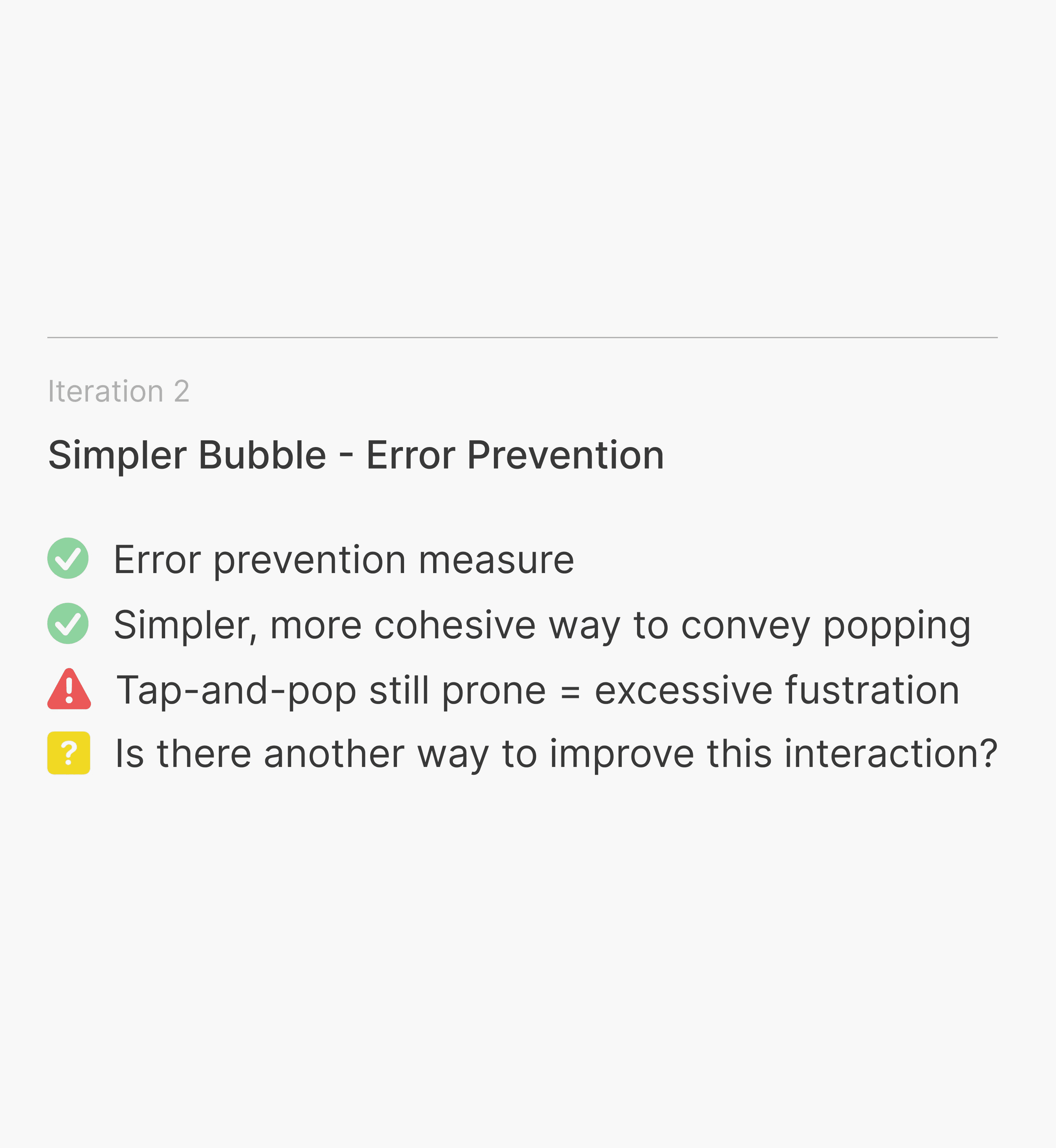
My second iteration featured a simpler popping mechanism and eliminated the countdown. After popping the bubble, users had five seconds to undo the action in case of a mistake. However, the five-second undo feature may not fully prevent accidental pops as users might not notice it in time or react quickly enough.
Pop by long-press gesture
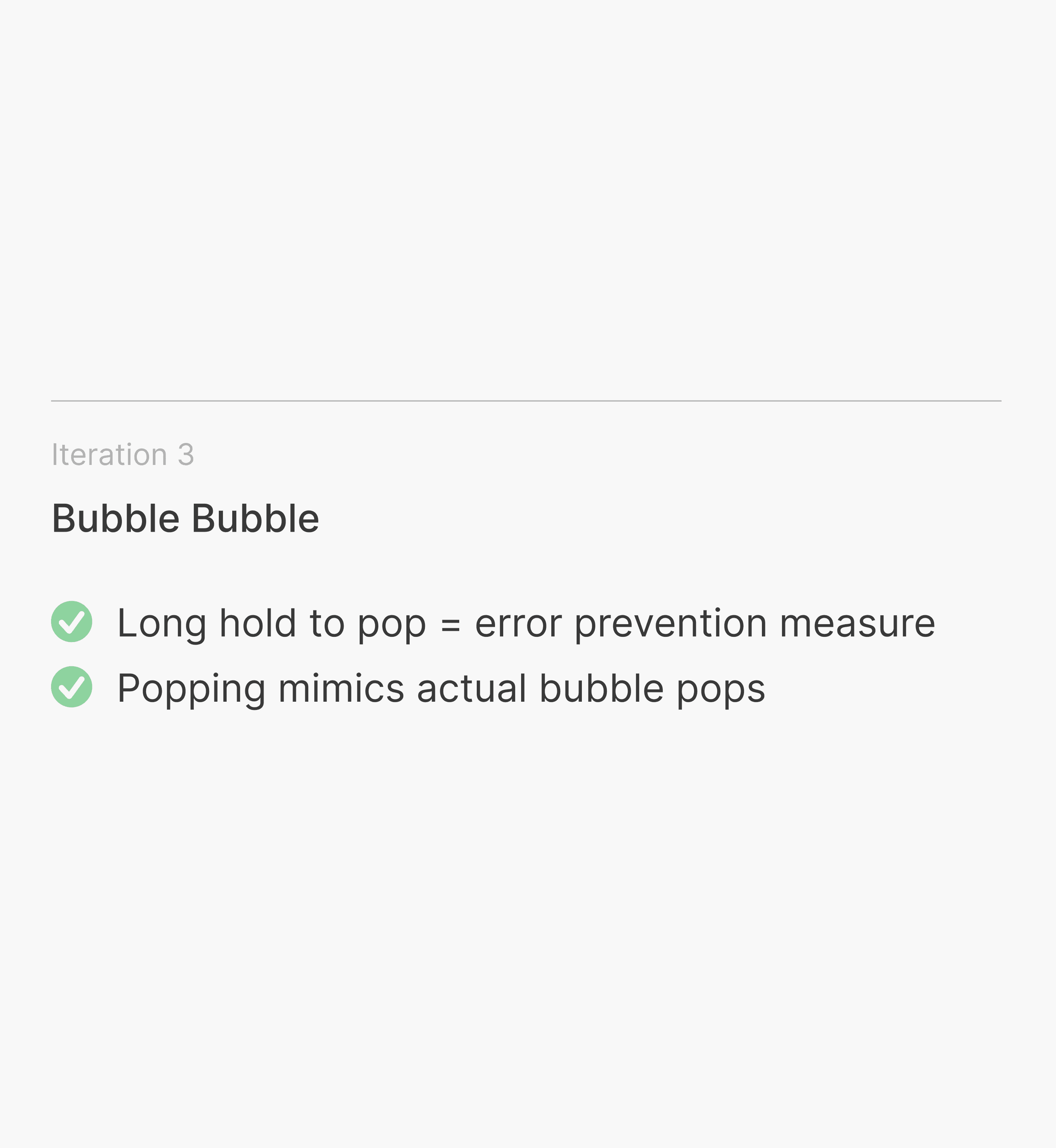
Recognizing the issues with the tap-to-pop mechanism, I opted for a long press gesture that mirrors the "blow a bubble" interaction and with its design replicating the burst of a real bubble. Combined with a visible loader, this minimizes accidental triggers and offers visual feedback, giving users time to reconsider their actions to reduce potential errors.
Impact
What do students think of Bubblofi?
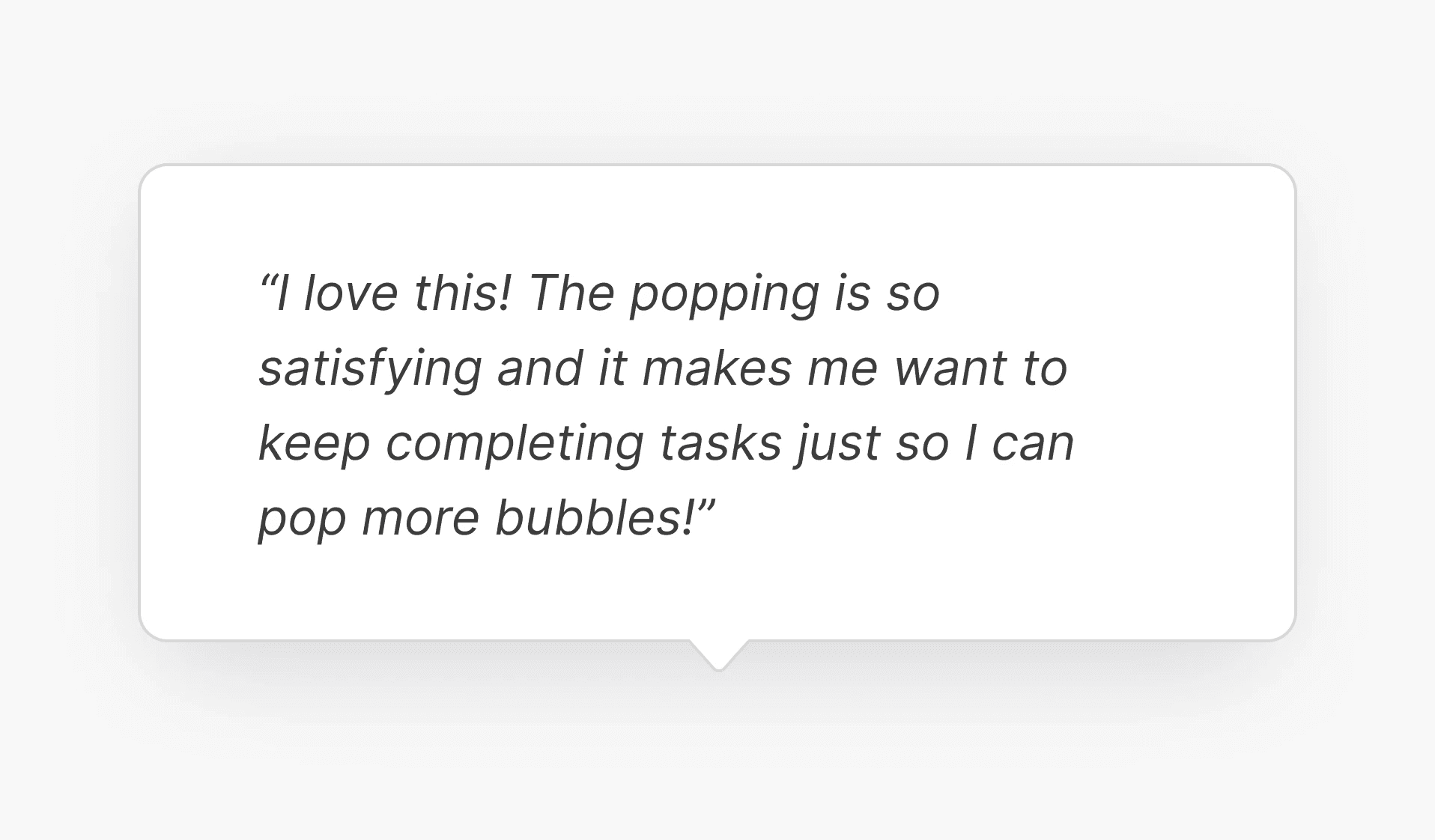
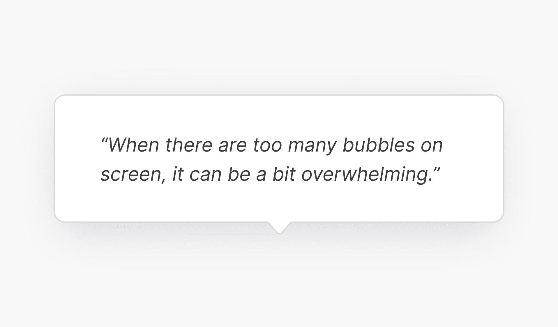
Given the project scope and constraints, I couldn't measure quantitative results; however, the following are testimonials from students regarding Bubblofi's impact.
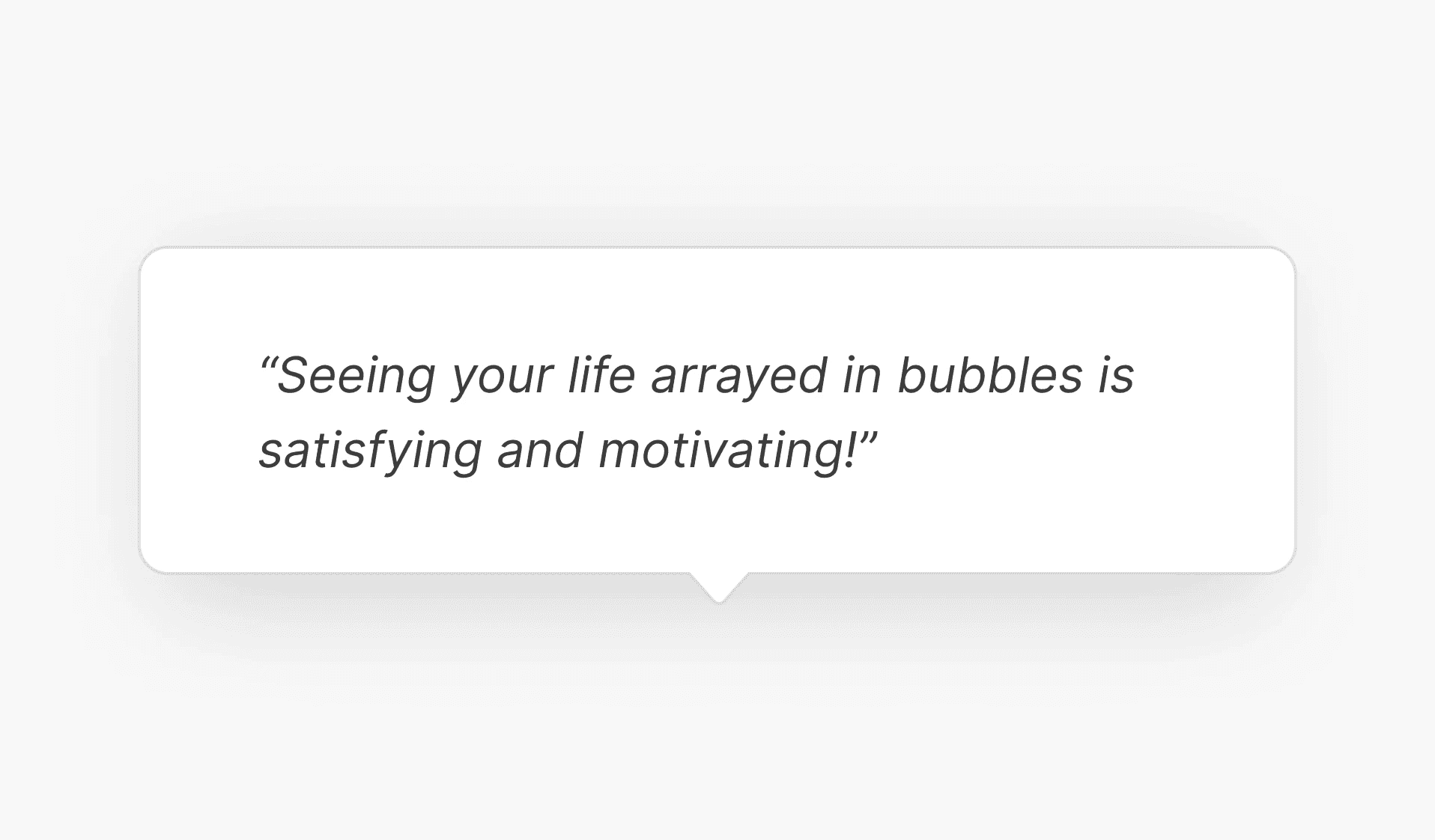
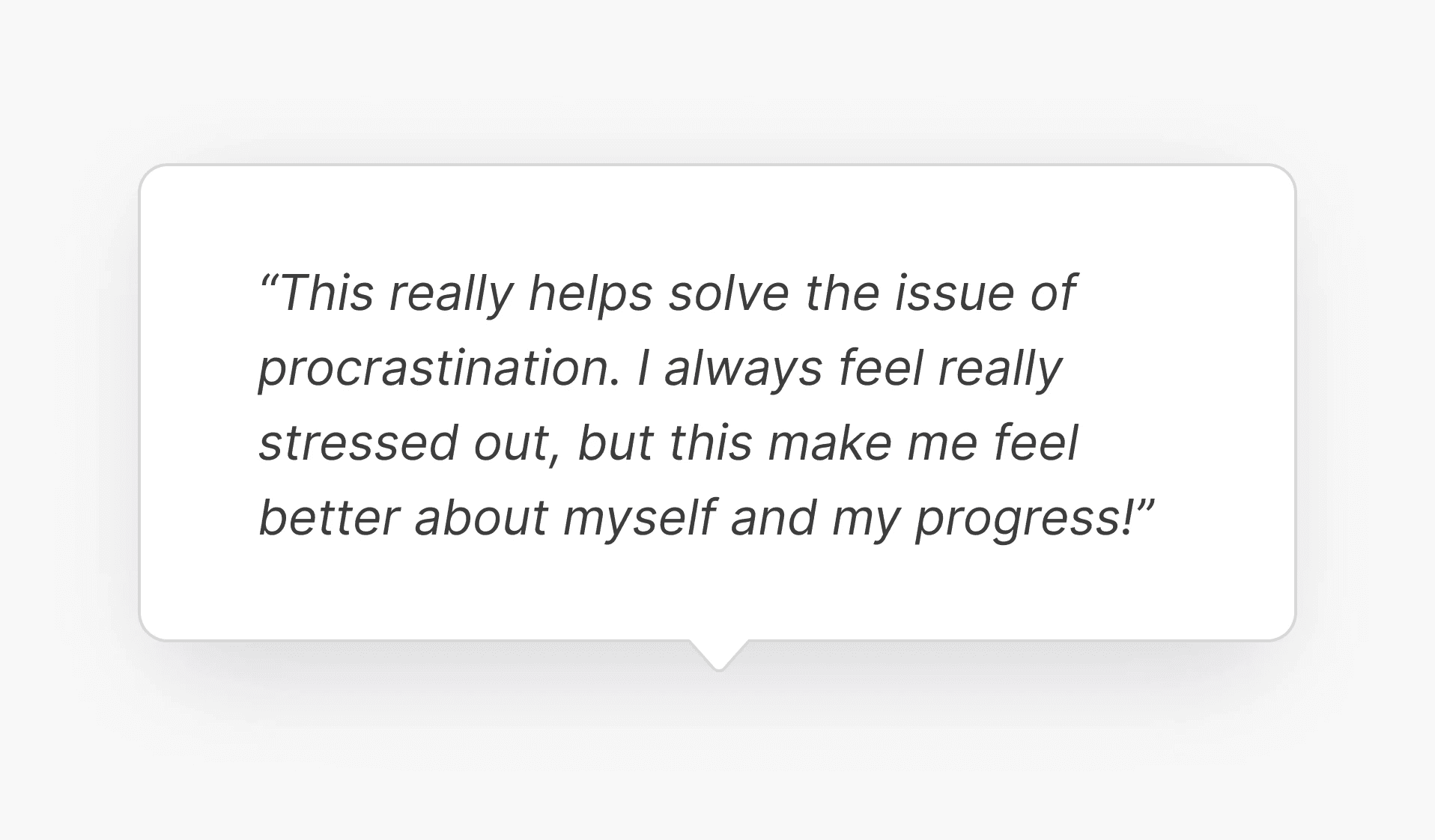
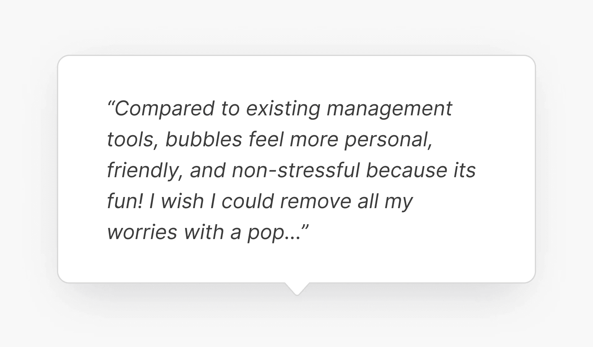
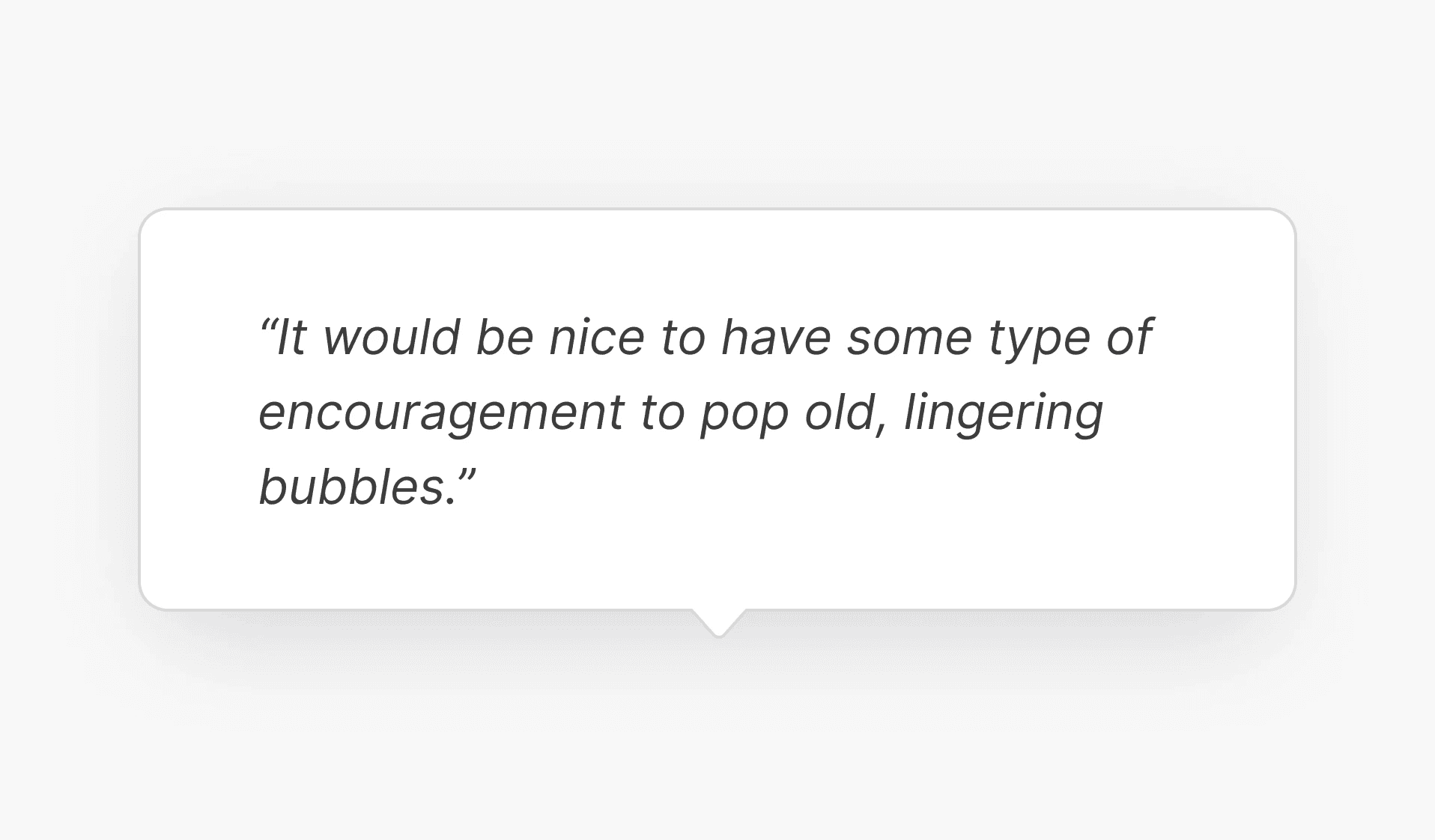
I also received valuable feedback and recommendations to consider for further iterations.
Reflections + Takeaways
My closing thoughts.
With this being my first UX project, I was questioning whether my final product came out too creative or it was
Know your audience
This project heavily involved human-centered design approach which i felt was missing in many apps.
Complex -> simple
If I
Beyond initial expectations
Fascinating this cumulative process was.. it was a long five weeks and initially thinking that my findings were too minor, but feedback from … indicated that these leads are necessary to create a far more human experience.
What's next? If I had more time…
Timing made it difficult to do additional testing. Bubblofi is in its initial stages
